Ad Safe Zones: Preview Before You Publish
An ad safe zone is the part of your creative where you plan to keep essential text, branding and product details clear of placement controls. Check it while you design, before the final export. YieldBI’s free ad preview and safe-zone tools let you try local images and videos in representative mobile ad layouts, then download transparent guides to use in your editor.
The file can be the right size and still communicate badly. A discount behind a caption, a subtitle under an action button, or a product cropped at the edge can make the message harder to understand. Safe-zone planning catches these composition problems before they become another exported version.
What should stay inside an ad safe zone?
Start with what a viewer needs to understand the offer: the opening message, the relevant part of the product, the benefit or price, and any text needed to make the offer clear. Keep a deliberate gap between those elements and the interface areas you are checking.
The entire background does not need to fit inside a dashed rectangle. A wall, a landscape or a decorative shape can extend to the edges. A small product label or a line explaining the offer deserves more protection. Decide which details matter before moving everything toward the middle and making the ad cramped.
Safe zones also vary. TikTok’s In-Feed specifications tie their size to the creative dimensions, caption length and additional formats. Google likewise notes that YouTube overlays and buttons can appear in different positions. One guide is not a universal clearance certificate.
What does a safe-zone problem look like?
Consider a fictional Nova Home lamp ad. The product photograph looks good, but the offer and Shop now prompt sit near the bottom. If a caption panel covers that area, the offer becomes difficult to read. Moving the offer upward and leaving room around it gives the message more clearance.
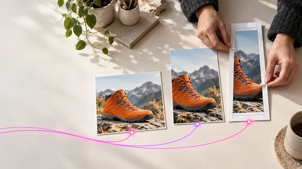
The hero image shows this kind of composition review with an illustrative guide, not an exact platform interface or a performance result. Move the essential information rather than simply shrinking the whole ad until every element fits.
Cropping adds a separate risk. A centered crop from 1080 x 1920 to 1080 x 1350, keeping the width unchanged, removes 570 vertical pixels: 285 from the top and 285 from the bottom. Text placed within the top 200 pixels will disappear. Moving the crop might save that headline but lose a low offer. At that point, make a separate composition.
What do YieldBI’s free tools offer?
The tools cover seven platforms. Choose the page for the ad you want to inspect:
| Platform | Tool |
|---|---|
| Preview Feed, carousel, Stories and Reels ads | |
| Check Facebook ad framing and guides | |
| TikTok | Inspect a vertical ad composition |
| YouTube | Preview supported YouTube ad layouts |
| Check supported LinkedIn creative layouts | |
| Preview Pinterest ad framing | |
| Snapchat | Check Snapchat ad composition |
Upload an image or video from your device and switch between the available placements. Your creative stays in the browser tab; the preview tool does not upload it. Video playback controls let you pause on a frame and inspect where the message sits.
Use Fill / crop or Fit entire file, then adjust the vertical and horizontal position. Toggle the platform illustration, safe-zone guide and shaded areas to see what each layer contributes. These controls change the preview. They do not edit, resize or transcode your original file.
How do you use a transparent safe-zone template?
Download a PNG or SVG guide and place it above the matching canvas in Canva, Figma or your video editor. Its content area stays transparent so you can see the creative underneath. A ZIP includes the platform’s default SVG guides for checking several placements.
The download is a guide, not your ad with a frame attached. Match the canvas dimensions, keep the guide on a separate layer, and hide or remove it before exporting the finished ad. Custom margins let you make a more conservative guide for the composition you are working on.
Previewing is free without registration. Template downloads require registering for YieldBI updates, confirming your email and accepting browser tracking consent. If your email is already confirmed, enter the same address rather than starting with another one.
What should you check before publishing?
Check the hook, product, offer and any burned-in subtitles at the moments when they appear. Then switch placements and repeat. Do not approve a video from its first frame alone, or assume that a clear portrait version means the square crop is ready.
YieldBI’s layouts are representative. Some guides use reference values; others are illustrative starting points. Caption expansion, ad formats and interface changes can affect the available space. Use the tool to catch composition issues, then confirm the actual creative in the platform’s own ad preview before publishing.
For Meta, our placement guide explains why checking only Feed leaves other layouts unexamined. Our creative-format guide helps separate the choice of format from the message you want to test.
A useful creative brief includes the intended placements and a safe-zone check alongside the hook and offer. Start with your next asset in the free tools, fix the collisions, and bring the guide back into your design workflow. YieldBI’s creative and campaign features support the next steps beyond that composition check.